
Harnessing the Power of Color in Healthcare
KwickScreen in collaboration with DesignPool
As we move through a built environment, decisions that interior designers and architects have made about color can impact our behavior. Designers have long known that color choices can impact a person’s mood, buying habits, or hunger levels. While this is most noticeable in places where people are shopping and eating, it is also important in healthcare facilities. Using color intentionally when designing hospitals and other healthcare facilities can cultivate a mood and set an overall tone that is calm, soothing, and ultimately helpful to people in a stressful situation.
Several studies have shown that color can have a positive effect on patient well-being thus impacting patient outcomes. Color can greatly impact a person’s mood by reducing stress and anxiety whilst also improving patient sleep. It can also impact staff well-being, increasing satisfaction and productivity. When used wisely in interior design, color can serve as one more tool to create a positive experience for patients, visitors, and staff alike.
Five ways to think about color in healthcare interiors.
Consider aging eyes when choosing colors.
How humans see color changes as our eyes age. The lenses in the human eye gradually yellow as people age, making it seem like a person is looking through a yellow filter. As a result, pure whites get a creamy tint and it can be difficult to differentiate between some colors, especially colors of similar value. If designing for senior living facilities, consider using warmer colors with more contrast to each other.
White isn’t always the answer.
Historically, white was a common color for healthcare interiors because it is often associated with cleanliness and hygiene. Materials used in hospitals also needed to withstand rigorous cleaning, often with bleach. Practically, it is also a blank slate on which to view a patient. For example, some colors can influence how a person’s skin tone is viewed, such as too yellow or too blue. Yet, white can also feel cold and unwelcoming. For some populations, white is also associated with funerals. Use white where necessary but consider offsetting it with appropriate color so as not to be overwhelming.
Consider the population you’re serving.
Color is very ingrained in our culture and the meaning and significance of color vary widely around the world. Just as white can be either bridal or funeral, depending on where in the world you are, so can many other colors. When redesigning a healthcare facility, first consider the population it will be serving and research their cultural associations with color.
Use color for wayfinding.
Hospitals are often sprawling and hard to navigate, especially for many of the people there during a stressful or emotional event. Making it easy for visitors to orient themselves is important to relieve pressure on staff, patients, and visitors. Use color as a way to communicate to people who may not read or speak the language, so they know where they are in a place. This can be helpful for signage, such as yellow communicating caution, or to identify which area you’re in, such as the emergency room or children’s ward. Yet, stick to the fewest number of color zones as possible to make it easy to understand by most people.
Always consider function first.
Large healthcare facilities such as hospitals treat a wide range of people and problems, so no one color will be perfect for an entire building. Designing for a children’s area would be different from seniors. For example, red can be overstimulating to the brain and increase blood pressure. Yet, for children, it can also increase social confidence. Think about what a space will be used for and by whom when choosing a color.
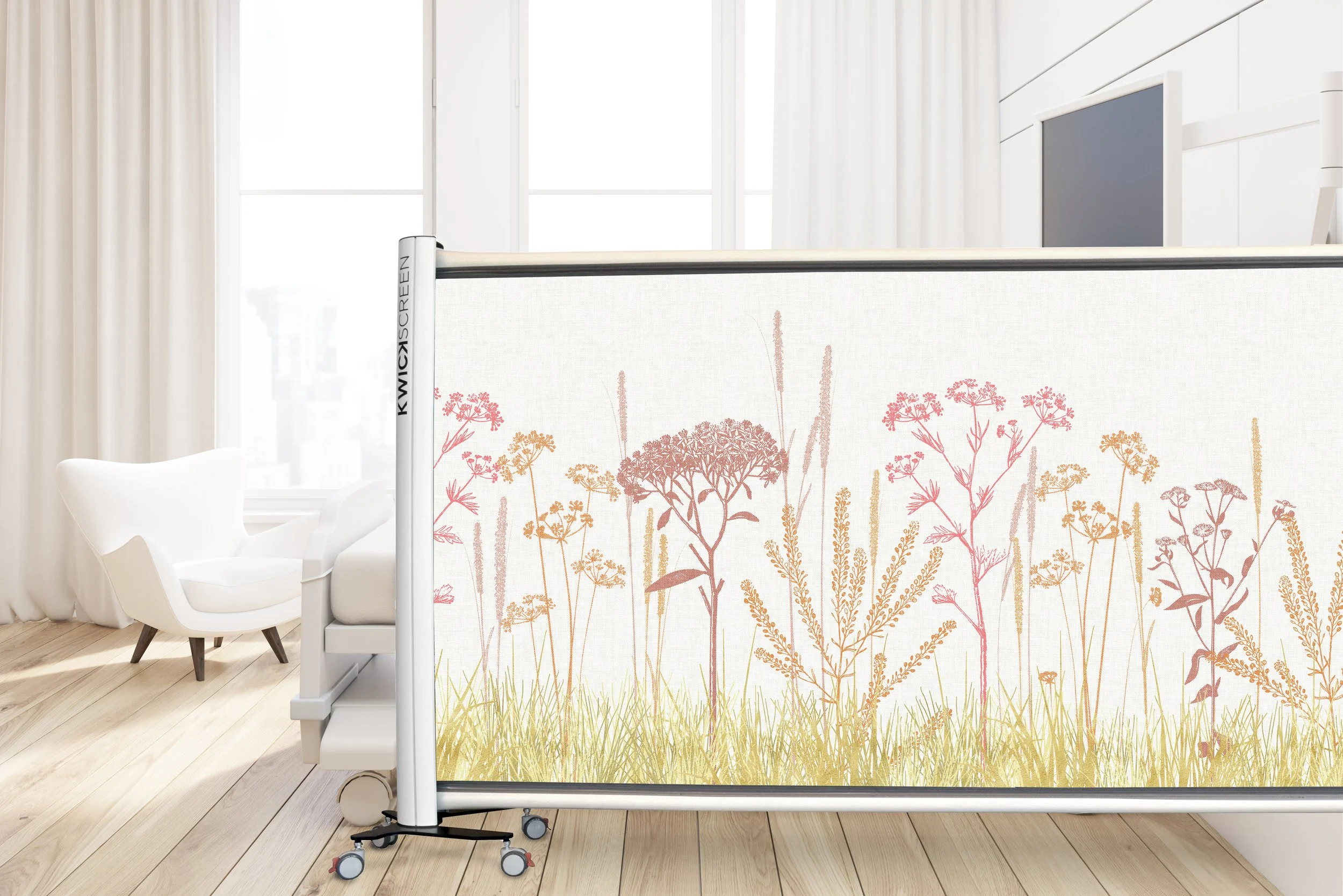
Color is a powerful tool. When used smartly by designers, it can make a big impact on a person’s experience of a place, beyond just walls and furniture. Consider adding pops of color and pattern to a space quickly with any one of KwickScreen’s products. All the retractable screens are fully customisable meaning they can be made bespoke to match the color scheme and design of your space. For example, bringing the outside in with our botanical and landscape collections can help patients and staff escape from the clinical environment of the hospital.
Sources:
The Role of Color in Healthcare Environments, Social Anthropology Journal
How Our Perception of Color Changes as We Age, Hunter Lab
Color Perception and the Aging Eye, Sherwin-Williams
Using Color in Healthcare Environments, Design Pool
Healthcare Design: The Psychology of Color, Fohlio
The Application of Color in Healthcare Settings, The Center for Health Design
Author bios:
Kristin Crane is the Director of Marketing & Communications for Design Pool, the only online pattern library created exclusively for interior designers. Based in Rhode Island, in the United States, she writes about textile design and digital printing for Design Pool.
Orlagh Flanagan is the Marketing Manager for KwickScreen, dedicated to giving every patient a hygienic space. Based in London, in the United Kingdom, she creates written and video content covering all things KwickScreen.